Type at Size
What survives at 15px, and what only works at 90. The face that carries a masthead is the same one setting the caption underneath it, and the second job is the harder one.
-
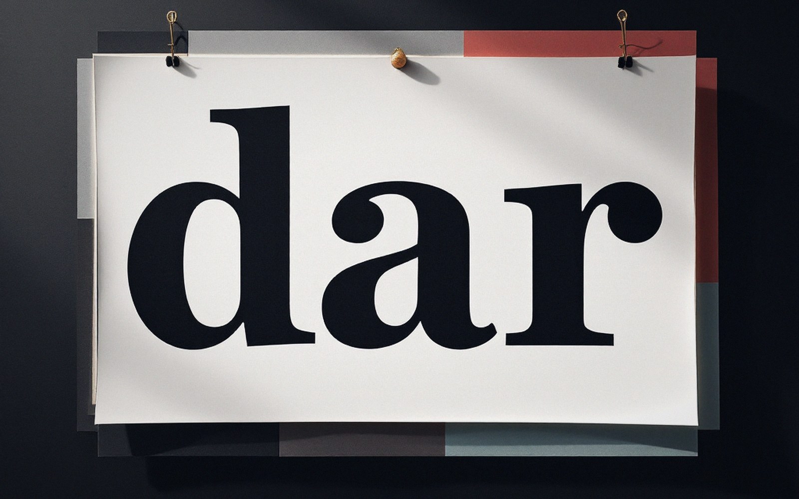
Serifs returned as a signal
After a decade of geometric sans everywhere, serifs came back — not because they read better but because they read as a decision. What the move actually signals, why it arrived at display size first, and where it falls apart when it reaches body copy.
-

Big type is cheap
Setting a headline at 120px is the least expensive way to look designed, which is exactly why so much of the web now does it.
-
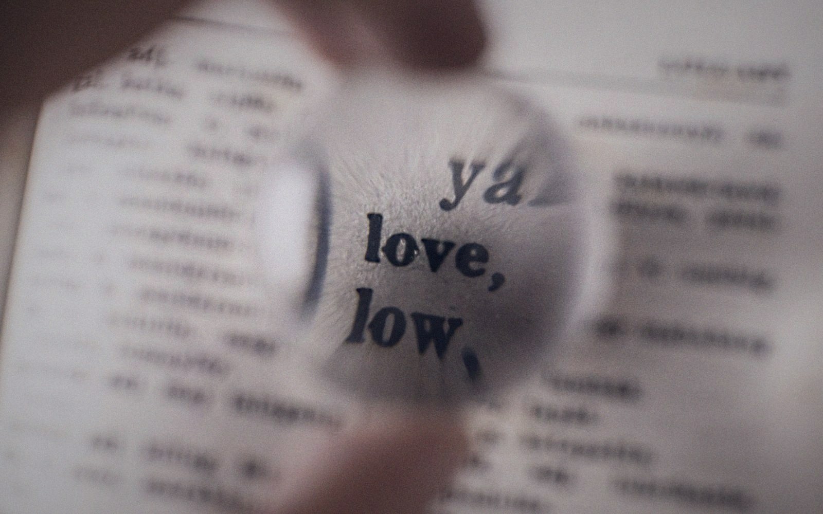
The fifteen-pixel test
A face that is beautiful at 90px and illegible at 15px has failed, because sub-heads, decks and captions all live down there and there are more of them.
-
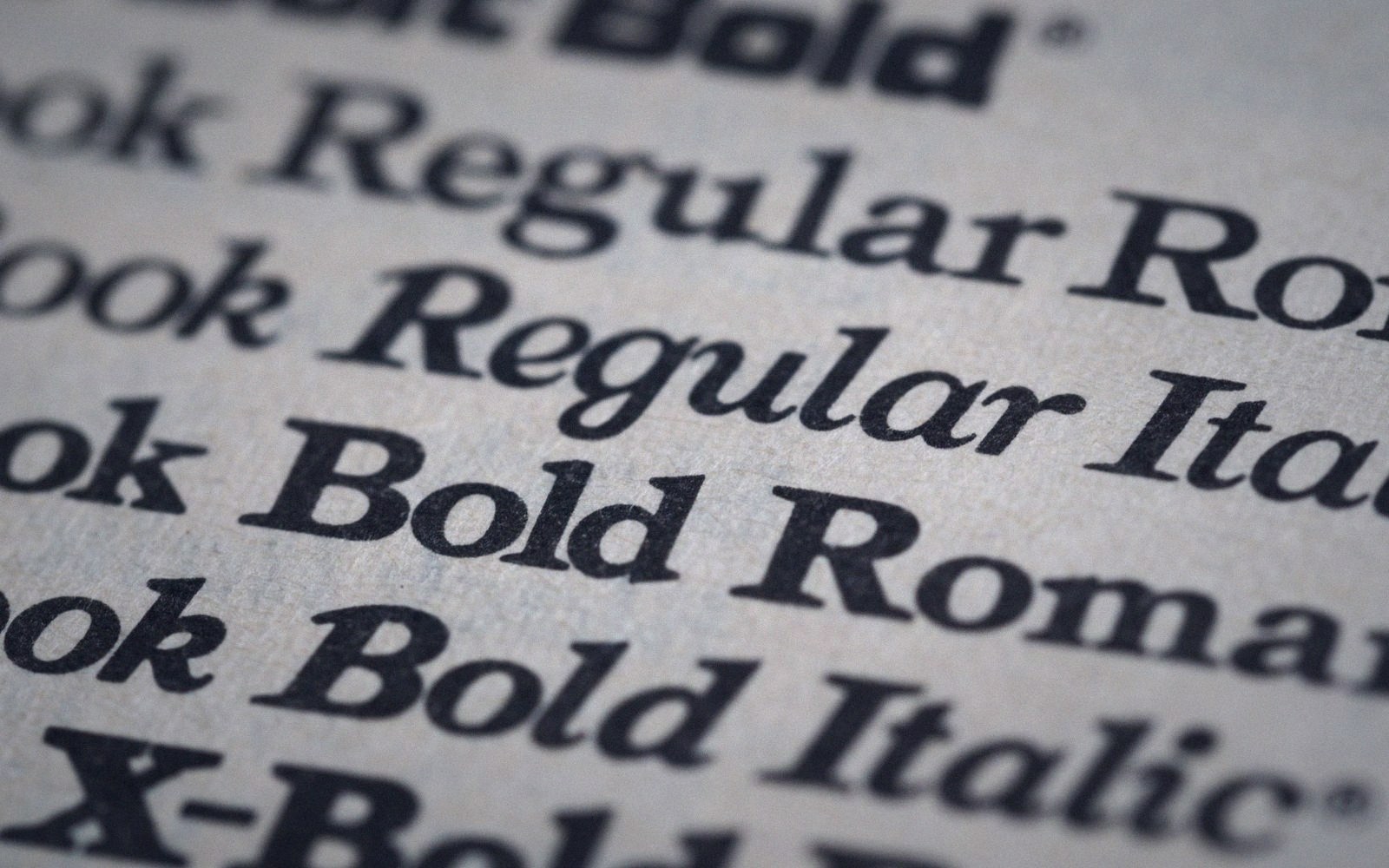
Variable weight as a crutch
One family at nine weights solves a licensing problem and creates a hierarchy problem.