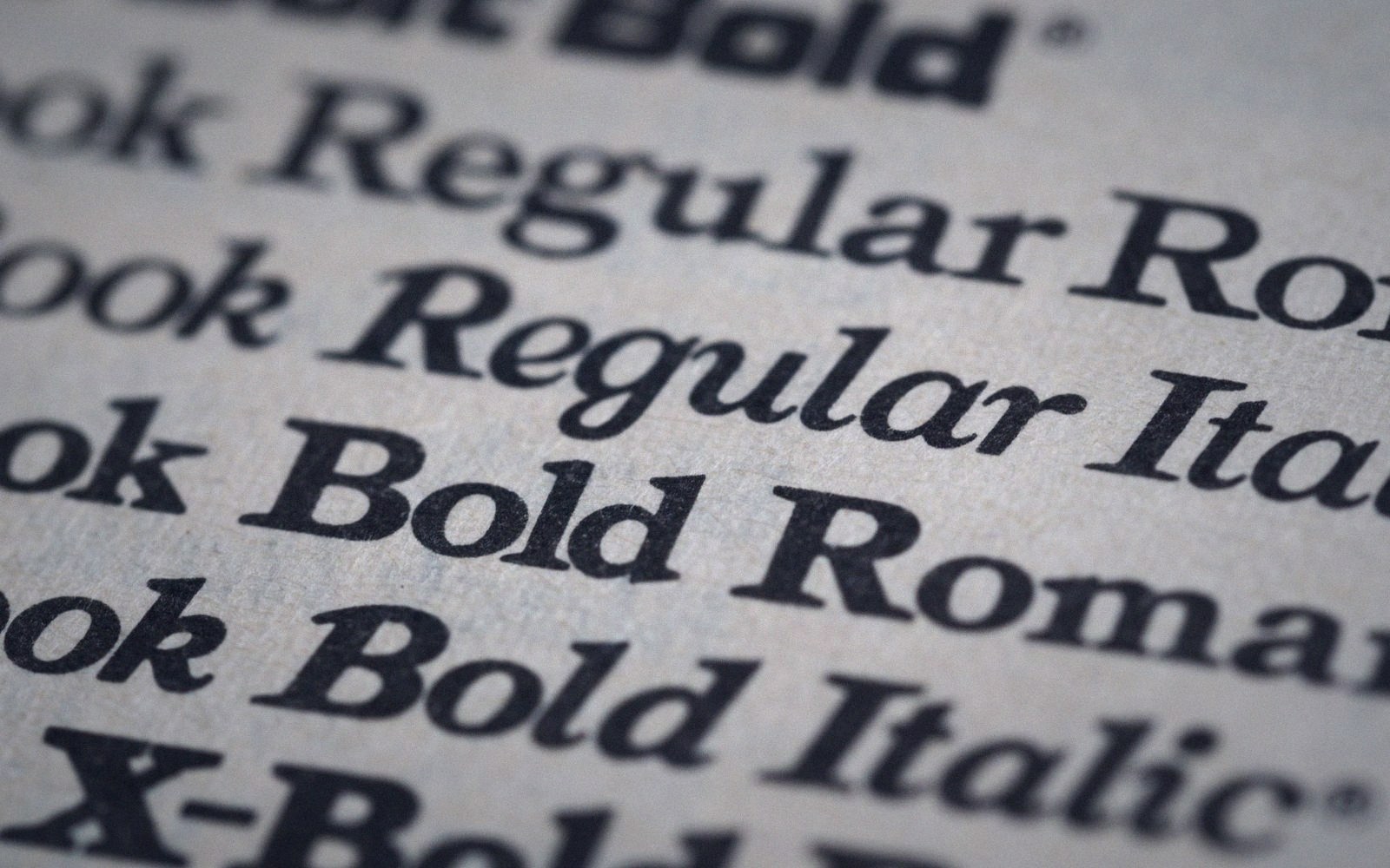
The problem with infinite variation
Variable font technology is genuinely impressive. A single file, one licence, and a weight axis that runs from hairline to black — the engineering argument is tight. Teams adopted it fast, and the licensing logic is real: one purchase covers the whole family, no per-weight fees, smaller HTTP payload than loading four separate cuts.
But the design logic that followed is shakier. Once you own every weight, the temptation is to use them to build hierarchy rather than to first ask what hierarchy actually needs. The result is interfaces where body copy sits at Regular, subheadings at Medium, headings at Semibold, display text at Bold, and labels at Light — a smooth gradient of weight that reads as undifferentiated because nothing stands far enough apart from anything else. The fifteen-pixel test reveals this quickly: at small sizes, the middle weights of most variable families collapse into near-identical grey.
True hierarchy needs contrast, not graduation. Size, colour, spacing and weight all contribute, but weight only does real work when the jump is large — think Regular to ExtraBold, not Medium to Semibold. Splitting a family into nine finely spaced steps encourages the kind of incremental thinking that produces a stack of weights where each one is justifiable and none is decisive.
There is also a subtler effect: single-family systems flatten the tonal range of a page. A headline and a caption set in the same typeface, even at opposite ends of the weight axis, share an underlying voice. Introducing a second face — even a simple serif/sans pairing — instantly creates register difference that weight alone cannot generate. But if the licence only covers one family, that move costs money, and so it often doesn't happen.

The variable font solved a real procurement problem. What it quietly encouraged was treating typographic hierarchy as a slider rather than a set of deliberate, wide-interval choices. Weight is a dimension, not a system.