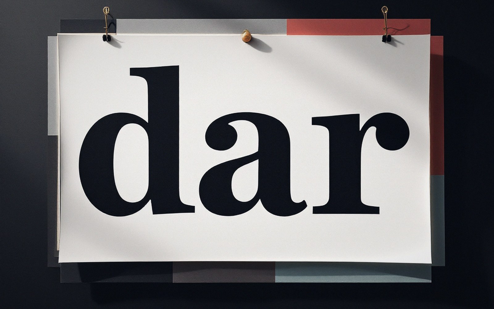
How the sans became the default
The geometric sans had a remarkable run. For the better part of a decade — roughly 2012 through 2022 — it was the unmarked case of digital type: neutral, legible at pixel sizes that once killed finer details, and available in weights that could substitute for a full typographic system if you stretched the sizes far enough. Rendering engines improved, screen densities rose, and the old practical argument for sans — that serifs clogged at low resolution — gradually lost its bite. But habits outlive the conditions that created them. The geometric sans kept arriving by default, embedded in system UI, starter templates, and component libraries that nobody had specifically chosen. It became what the choices nobody made look like: a style that reads as no style.
Designers noticed. When everything shares a typeface category, the category stops communicating anything. Differentiation requires departure, and the available departure — the one nearest to hand that carried genuine historical weight — was the serif.
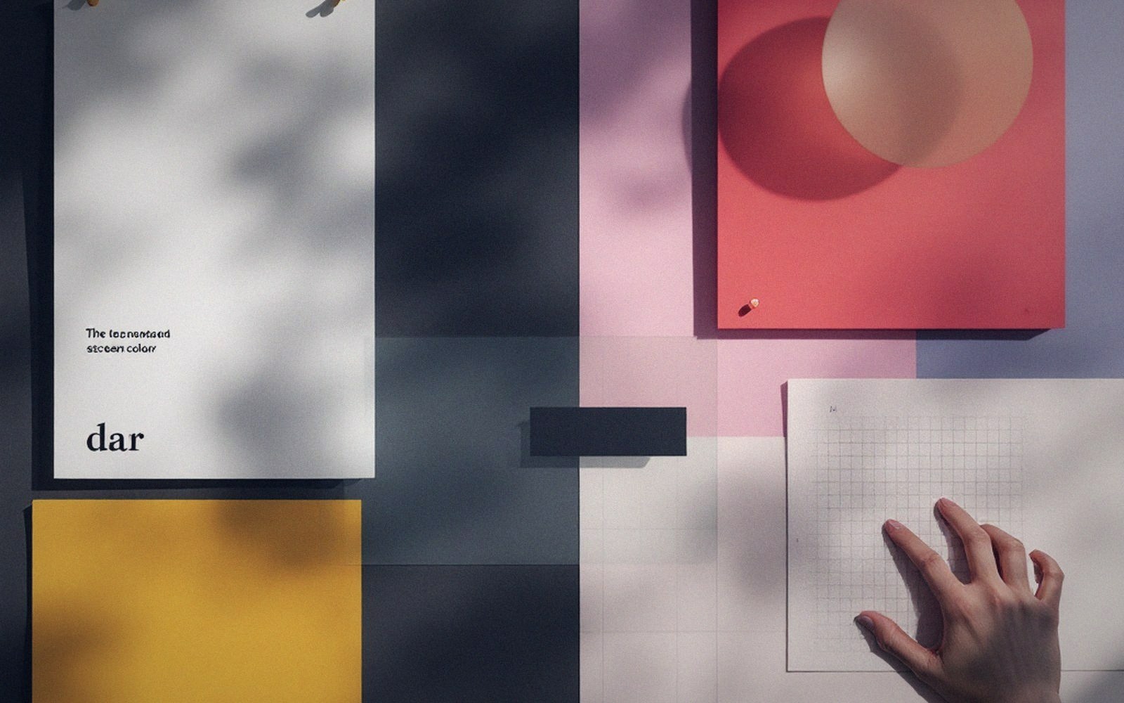
Display first, body never quite
The return of the serif was, and largely remains, a display phenomenon. It arrived at headlines first, because that is where type operates as image: a 90-pixel word is a shape before it is text, and the bracketed terminals, tapered strokes and ink traps of a classical or transitional serif read as deliberate texture at that size. The serif at display scale signals someone made a choice here — which is, bluntly, the primary job. Identity work that leaned on a refined serif at the masthead was buying cultural association: editorial, considered, pre-digital in affect even when deeply digital in execution. A well-set serif headline above a generous measure of pale background reads, in roughly this order: weight, then detail, then word, then meaning. The detail — the serifs themselves — is doing visual work before language kicks in.
That sequencing is the mechanism, and it explains why the trend arrived at display size first and stayed there longest. It also explains the trap waiting at smaller sizes. Body copy is not an image. Below roughly 18 or 20 pixels on screen, the serif's distinguishing details — the features that made it legible as a choice — become noise competing with letterform recognition. On sub-retina displays, on certain rendering stacks, or wherever anti-aliasing softens the stroke, a fine-cut serif at reading size loses the very quality that justified its selection. It goes blurry around the ankles. The result is a typographic hierarchy that argues with itself: the headline is doing one thing, the running text is doing something less assured, and the reader feels a mismatch without necessarily knowing why. The fifteen-pixel test applies hard here — a face chosen for its character at 90px has to earn its place at 15px, and many of the serifs that arrived during this wave had not been designed with screen rendering as the primary concern.
What the signal actually says
Every typographic signal is read against a context, and the current serif revival reads against the decade of geometric sans that preceded it. That context will not hold indefinitely. When enough surfaces have adopted a serif at the masthead, the signal inverts: the serif stops meaning decision made and starts meaning keeping up. That is the faster version of what happened to the geometric sans — it just happened to the sans over a longer period, with deeper institutional entrenchment, because its adoption was tied to framework defaults and system fonts rather than to deliberate choices.
The serif's current authority is borrowed from scarcity, and scarcity is being spent. What does persist across fashion cycles is fitness: a typeface designed for screen rendering, hinted and spaced for screen rendering, and tested across the full size range from display to caption will outlast one chosen purely for its mood at large size. The serif families that survive the trend will be the ones that were built for the medium rather than pressed into service for the signal.

There is also the question of which serifs returned. The revival skewed heavily toward oldstyle and transitional designs — or toward contemporary faces that imitate their proportions, calligraphic contrast and bracketed serifs. The slab serif, which had its own earlier moment as a workhorse of app design, remained largely decorative. Hairline-contrast high-fashion serifs appeared at the extremes of luxury branding. The bulk of everyday adoption landed somewhere in the readable middle: medium contrast, generous x-height, open apertures. In other words, designers reached for serifs that behaved well at screen sizes, which reveals that legibility was a constraint even when it was not the motivation.
Where it falls apart
The places the serif revival looks weakest are predictable once the mechanism is understood. Long-form body copy in a fine transitional serif on a dark background produces the worst outcome: fine strokes disappear, the texture that was desirable at 80 pixels becomes visual noise at 16, and the reader works harder for each line without knowing they are working. Dark mode specifically undoes the display-serif calculus, because the logic of serifs-as-texture depends partly on positive contrast — dark ink on light ground — where thin strokes are readable as thin. On dark mode, the same strokes approach invisibility. This is not an argument against serifs in dark mode; it is an argument that a display-size choice does not automatically extend to body and small UI, and that dark mode requires its own typographic reasoning.
The trend also falls apart wherever it becomes a texture rather than a hierarchy.
The trend also falls apart wherever it becomes a texture rather than a hierarchy. When the serif appears at every level — headline, subhead, pullquote, caption, label — without being modulated by weight, size, or spacing, the initial signal is lost. A decision that is everywhere stops reading as a decision and starts reading as a condition. The virtue of the geometric sans, at the height of its ubiquity, was that it disappeared into the content. The virtue of a serif, in this moment, is that it does not. Use that visibility carefully, at the scale where it earns it, and it is a genuinely useful tool. Treat it as a style to be applied uniformly, and the signal fades to background noise just as the geometric sans eventually did — just faster, because the borrowed scarcity burns through quicker than a decade of framework defaults.