The cost of free confidence
Scale costs nothing in CSS. A font-size value is changed in seconds; no illustration is commissioned, no photograph sourced, no layout system renegotiated. This is why display type has ballooned across the screen in the last several years — not because designers suddenly fell in love with the oversized letterform, but because large type solves a genuine problem cheaply. An empty page with a single massive headline reads as intentional. The scale performs confidence the design may not have earned.
The move has real precedent. Swiss International Style posters used type at monumental scale because print demanded a hierarchy that worked at distance. Editorial designers in the 1990s pushed display sizes to signal that a magazine section had changed register. Both of those uses were choices made against a complete composition. The screen version is more often a shortcut: the type is big because nothing else is doing the work.
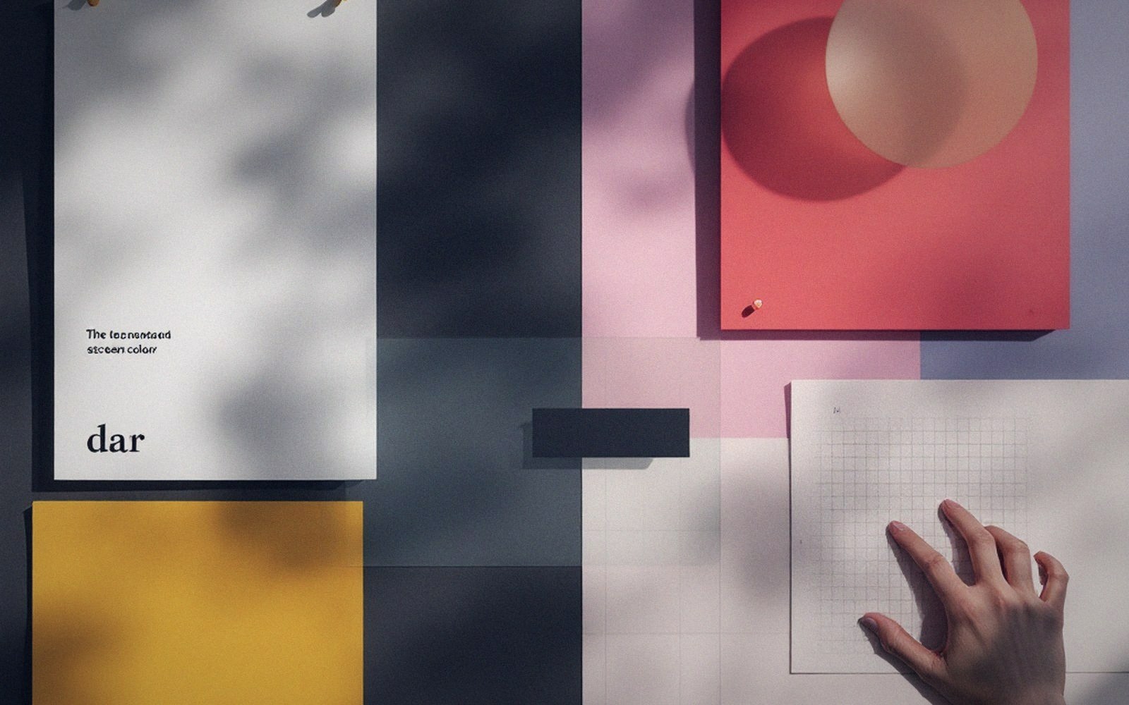
What "nothing else is doing the work" looks like in practice: a hero band containing only a line of text at 96px or above, a background that is a flat colour or off-white, and a CTA button in the lower third. The type carries all the visual mass. That is a legitimate layout — but it demands that the typeface, the weight, the tracking and the leading be genuinely considered, because when type is the only thing, every decision about it is exposed.
Where the money ran out
The reveal happens at smaller sizes. A face chosen because it looks spectacular at 120px may be doing nothing coherent by the time it reaches a subhead at 22px, a caption at 13px, or a navigational label that must remain legible in a cramped mobile header. A face that is beautiful at 90px and illegible at 15px has failed, because the subhead and caption are where the reader actually spends time. Display scale is a first impression; the mid-sizes are the relationship.
Tracking compounds the problem. Loose letter-spacing at large sizes is optically correct and looks assured. Designers sometimes carry that same tracking value down into body-weight settings, where it strings words apart and destroys the texture that makes a paragraph readable. The big type set the mood; the tracking value set in one rule then broke everything below it.
Weight is the other fault line. Variable fonts have made it easy to dial a headline to an extremely light weight at extreme scale — the combination reads as refined because the counter spaces are generous and the strokes catch light elegantly. Drop that same weight to body size and the strokes disappear entirely on low-luminance displays or in direct sunlight. The headline was optimised for its own effect and the rest of the system paid.

What the scale actually demands
The practical problem with leading with scale is that scale raises expectations for everything that follows. A 120px headline tells the reader that this is a considered piece of communication. When the body text below it sits in a default line-height, set in the same weight as the display headline because the designer never revisited it, the gap between the implied quality and the actual craft is visible. Readers do not name this gap; they feel it as vague distrust.
None of this argues against large type. It argues that large type is not a solution — it is a bet that the rest of the system is good enough to honour the promise. Setting type at display scale and doing the work means choosing a family that holds across the full range of sizes used in the design, mapping weights to roles rather than aesthetics, and checking that the mid-sizes — the deck, the label, the caption — are as considered as the headline. Big type without that system is decoration with good posture: it looks confident from across the room, and uncertain up close.
It argues that large type is not a solution — it is a bet that the rest of the system is good enough to honour the promise.
Scale is free. The design it implies is not.