The signal that stopped signalling
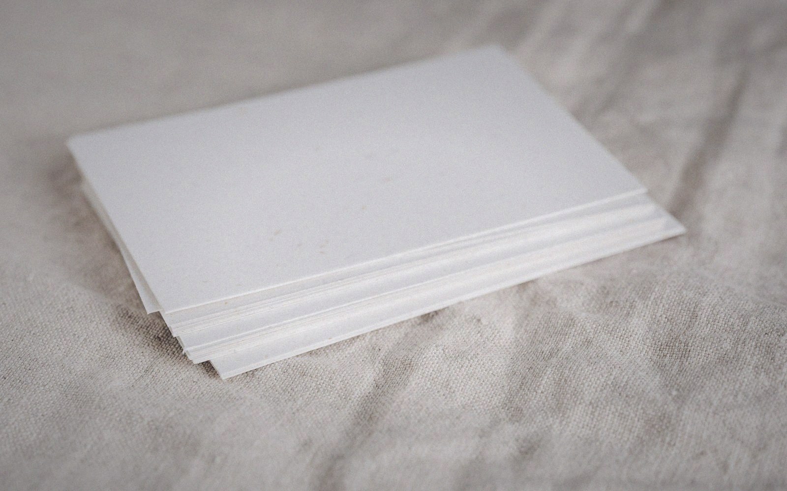
Pure white dropped out of fashion gradually, then all at once. The reasoning was sound: a true #FFFFFF ground on a backlit screen creates more contrast than most reading contexts need, pushing text toward harshness and tiring the eye over long sessions. Warm off-whites — creams, oatmeals, the faint ochres that sit just below 255 on the blue channel — arrived as a considered correction. They softened the glare without retreating into grey. They borrowed credibility from print, from the ivory of aged paper, from the kind of editorial design that had always known a ground colour carries mood.
That reasoning held. The problem arrived when the conclusion became automatic.
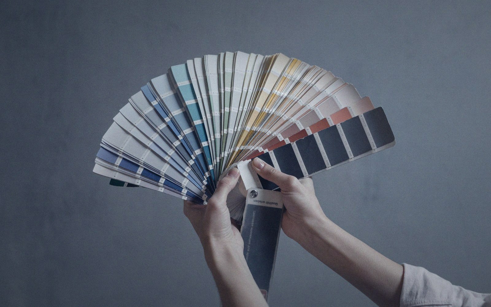
Scroll through a run of contemporary interfaces and you will find the same faint warmth repeated across contexts that have nothing in common — a financial dashboard, a recipe site, a software product, a literary magazine. The hue shifts slightly, the exact RGB varies, but the intention is identical: look considered, signal craft, avoid the clinical severity of pure white. The off-white is no longer a decision made for this project. It is the new default, and the choices nobody made are now warm rather than neutral.
What the choice actually involves
Choosing a ground colour is real design work because the ground is not background. It is the largest area of colour on the screen and it performs continuously. It determines how type reads against it — not just in terms of contrast ratio, which is a floor, not a target, but in terms of perceived warmth and tone. A warm ground pulls cool greys toward neutrality and makes them feel warmer than their hex value suggests; it makes a cold blue accent feel more foreign than it would on a neutral base. These are not small effects. They accumulate across a session.
The ground also governs dark mode. A warm off-white and a near-black do not simply swap polarity when the system theme changes; they either form a coherent pair — both carrying warmth, the dark a deep brown-black rather than a cool slate — or they contradict each other. Most products that adopted warm off-white as a light ground never thought through what the dark counterpart should be, and the result is a light mode that feels considered and a dark mode that feels generic. The two surfaces belong to different palettes by accident.
Warm grounds interact with imagery in ways that cool or neutral grounds do not. Photography shot in clean daylight will read differently on cream than it does on white; skin tones can warm past their original value; product images with clean white cutouts will float awkwardly, halos appearing at the edge. None of this is fatal, but all of it needs to be anticipated. If the images on a platform were not art-directed or retouched against the actual ground, the ground was not truly chosen — it was dropped in after the fact.
The cost of treating a trend as neutral
When off-white functions as a genuine ground decision, the designer has worked out which warmth level, why, and what it means for every surface the product owns — type colour, accent colour, image treatment, icon fill, the dark-mode counterpart. When off-white functions as a trend reflex, none of that work happens. The ground gets specified in the first week and never reconsidered, because it reads as obviously correct. That feeling of obviousness is exactly the problem.
A default is a choice you made without noticing. The warm off-white that once distinguished careful editorial design from the cold efficiency of pure-white interfaces now risks communicating nothing — or worse, communicating that the designer followed a direction without interrogating it. The signal has saturated. The way to recover it is not to abandon warm grounds, which remain genuinely better for sustained reading in many contexts, but to treat the decision with the rigour it always deserved. Which warmth, and how much? What does the dark mode cost? Do the images hold? Does the accent colour still read?
And it was only ever distinguished from a default when someone could explain why.
Off-white is a good answer. It is not automatically the right answer. And it was only ever distinguished from a default when someone could explain why.