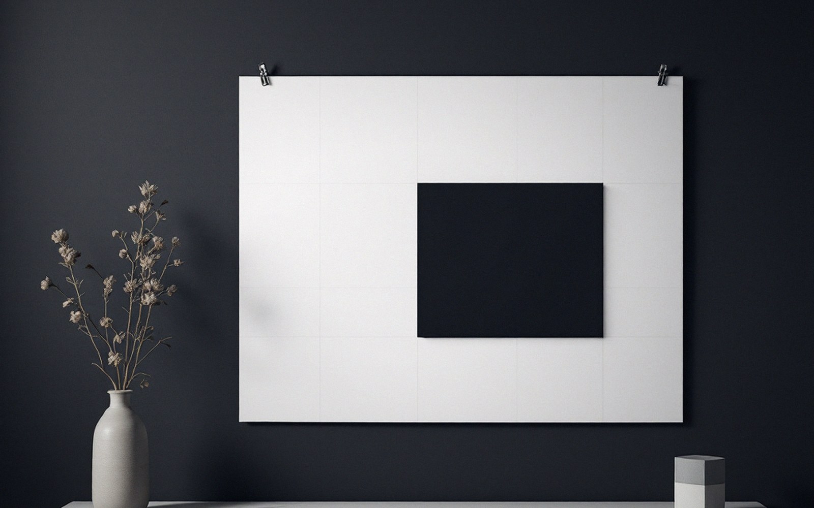
The paradox of deliberate disorder
A grid broken on purpose is still a grid. The offset column, the image that bleeds into the gutter, the heading that sits twelve pixels past the margin — none of these read as intentional unless there is a regular system underneath them, visible enough that the deviation registers as a choice rather than a mistake. Remove the underlying structure and you do not have a bold, dynamic layout. You have a mess that happens to have text in it.
This is the basic paradox of the broken grid, and it is surprisingly easy to miss when assembling a layout piece by piece. Each element gets placed for local reasons — this image looks better pushed left, that heading needs more air — and the result feels lively until you look at it alongside a page with real structure, at which point it deflates. The eye has nothing to snap against, no norm to feel the violation of. The disorder that was meant to signal energy reads instead as inexperience.
The principle has a longer history than the web. Constructivist designers in the early twentieth century — and later the Swiss typographers who codified grid theory through the 1950s and 1960s, figures like Josef Müller-Brockmann — understood that the expressive potential of asymmetry depended entirely on underlying order. The rule was never invisible. It was the ground against which every departure made sense.
What regularity actually does
On screen, the grid performs two jobs simultaneously. The obvious one is organisation: columns align elements into coherent relationships, give the eye a path, and prevent the cognitive cost of reading a page where nothing shares a baseline. The less obvious job is semiotic. A consistent structure teaches the viewer a grammar. Once that grammar is established, a single element stepping outside it carries meaning — it says this matters, or this is different, or this is where the sequence breaks. Without the grammar, no element can carry that signal because there is no contrast for it to push against.
This is why a layout with one overlapping element on an otherwise strict grid can feel genuinely dynamic, while a layout where everything overlaps at slightly different offsets feels restless and unresolved. Frequency destroys the signal. The asymmetry that costs maintenance is only worth paying for when the payoff is legible — and legibility here is not about type size, it is about whether the eye can locate the rule being broken.
The practical implication is that the grid needs to be real before it gets broken. Not sketched, not implied, not roughly honoured — actually constructed, with column widths and gutters that hold across breakpoints, baseline increments that are used consistently enough that a half-step away reads as deliberate. Designers who go straight to the expressive placement, hoping the structure will be inferred, are asking the viewer to do work the layout should have done first.

The cost of skipping the foundation
There is a shortcut that has become common: use a component system that enforces a grid by default, then override individual elements in the art direction layer, trusting that the underlying system provides enough regularity. This works, up to a point. The problem arises when the overrides accumulate. Each broken rule adds a piece of entropy to the system. If nothing is ever straightforwardly on the grid — if every section has its own exception — the baseline regularity dissolves, and with it the capacity for any single element to stand out.
The expressive broken grid requires discipline in exactly the place that feels least expressive: it requires most of the layout to be completely, almost boringly, regular.
The expressive broken grid requires discipline in exactly the place that feels least expressive: it requires most of the layout to be completely, almost boringly, regular. The drama lives in the exception. The exception only exists against the rule. Build the rule first, keep it strict across the majority of the surface, and reserve the break for the moment that genuinely earns it. A layout that breaks once, deliberately, on a foundation that is solid everywhere else will always outperform one that is loosely improvised from edge to edge. The grid is not the constraint that limits the design. It is the condition that makes the design possible.